Statistical Analysis
Delta2D includes a variety of statistical methods. Statistical analysis demands for replicates, thus the size of experiments is growing to enable significant findings. If you want to learn more about the methods, please have a look into the references that we recommend in the DECODON Academy area.
Heat maps and clustering
Heat maps are a well-known visualization method for expression data from DNA microarrays. Expression profiles are in the rows, gel images in the columns. The legend across the top shows the color code for spot intensities. Rows are labeled based on the spot labels from the gel images. By default, data is standardized to zero mean and unit variance before being shown in the heat map. Other options for normalization are available in the menu of the statistics table.
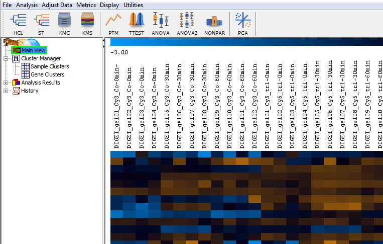
Clustering images: what image groups or classes are there?
Clustering methods can group expression profiles and gel images by similarity. This can be very useful for getting an overview of all expression profiles before proceeding with more detailed analyses. Clustering of gel images can also be used to detect outliers, and to identify structures in the experiment. Ideally, the cluster composition will reflect the structure of the experiment, e.g. replicates and images from the same sample should have similar expression levels and thus end up in the same cluster.
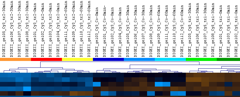
In the clustering above you see an experiment with control (Co) and treated (tr1, tr2 and tr3) samples, taken at three different points in time (0 min, 30 min, 60 min), made in quadruplets (i.e. 4 replicates for each of the samples). The clustering rediscovers the experimental setup, i.e. gel images with similar samples share a cluster. A sample forming a separate cluster would indicate an outlier for which closer inspection is advisable. Made using Pearson correlation as the similarity measure between images.
Clustering expression profiles: finding correlated proteins
Clustering of expression profiles is done to identify proteins with similar behavior, implying that they are co-regulated or at least correlated. The global nature of the cluster display allows for a broad overview and the forming of hypotheses that can then be tested.

Spots with similar expression profiles are clustered together. Support Tree clustering with Euclidean distance.
Discovering patterns in expression profiles
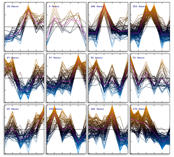
The mean (or median) of a cluster can be regarded as a kind of "typical" expression profile. The clustering displays allow you to split the set of expression profiles into separate subsets:
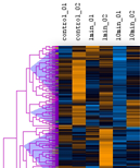
Cutting a tree is possible by a distance threshold which can be adjusted manually.
The expression profiles in the resulting subtrees can be shown as graphs:
Finding differentially expressed proteins: Statistical Tests
Methods for statistical hypothesis testing in Delta2D are based on state-of-the-art algorithms that are also applied in the context of DNA array analysis.
In the simplest case, the experiment is a comparison of two samples, e.g. diseased vs. control tissue, mutant vs. wild type etc. The task then is finding those proteins that show significant differences in expression levels. Certainly the most popular test in this area is Student's t-Test, where the null hypothesis is that the means of expression levels in samples A and B are the same. Rejecting the null hypothesis then means that the protein under test is differentially expressed.
The classical Student's t-test makes the assumption that spot quantities within replicates follow a normal distribution which should be tested separately. Depending on the staining method you use and other factors, spot quantities within replicate gels may not be normally distributed. Therefore it is advisable to use one of the provided methods that are based on permutations or use the Nonparametric methods.
Controlling the False Discovery Rate
When applying statistical tests to 2D gel data, you should be aware of the so-called multiple hypothesis testing problem: For each expression profile, a separate test is done. Each test has a certain probability of giving a false positive result, i.e. a protein spot is declared to be differentially expressed while the difference was due to pure chance. The large number of tests can produce a high number of false positives. For example, in an experiment with 2000 spots per gel, an accepted false - positive rate alpha of 5% will result in 100 proteins that are found to be "differentially expressed" although the difference is the result of mere chance.
The t-test module incorporated in Delta2D provides methods to control the proportion of false positives in the result set (False Discovery Rate - FDR). Overall, the False Discovery Rate approach allows one to strike a balance between the need to find statistically valid proteins of interest and the additional cost that is associated with following up on false positives.
Template Matching
With Pavlidis Template Matching (PTM), you can define a template for an expression profile and let Delta2D find spots whose expression profiles match the template. For example, in a time series experiment you might want to look for spots whose expression level increases with time.
![]()
Templates can be entered directly by specifying an expression level for every image or just some of the images. Alternatively a certain existing expression profile can be used as a template.

Graphs express the degree of congruence between the template and the found expression profiles.
Principal Component Analysis (PCA): Grouping and Visualization
When you do Principal Component Analysis (PCA) on a set of gel images, you get a two- or three-dimensional visualization of the image set that is optimal in certain sense, i.e. it preserves the variation as much as possible. PCA works by taking spot intensities on every gel image and assembling them into a vector. So an experiment of 48 gel images with 1200 spots each would be represented as a cloud of 48 points in a space with 1200 dimensions. The goal of principal component analysis is then to find a projection of the point cloud in two or three-dimensional space such that as much as possible of the variation of the point cloud is preserved. One hopes that the gels from different samples will be in separate regions of the resulting diagram.

The principal components can then be interpreted as "typical spot pattern" or "eigengels". Their coordinates can be analyzed in order to determine which spots are contributing most to the variance, making them candidates for protein identification and biological interpretation. PCA can be used for quality control, since gel images with quality problems would appear apart from the respective replicate group.
When principal component analysis is applied to the expression profiles, in our example we would consider a point cloud of 1200 vectors (one vector for each expression profile) with 48 dimensions (the expression levels on the 48 gels). The result is a display of the proteins where (hopefully) proteins with close positions are biologically related.
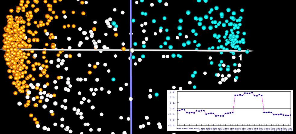
Consider a time series experiment, where proteins are switched on and off in stages. If there is a "hidden parameter", such as a stage in the cell cycle, it will have a systematic influence on the expression levels, and thus increase the variance for the genes taking part in it. This increased variance will then become part of the directions that are used for the projection (the principal components). The principal components can also be called "eigenprofiles", they can be seen as "classes of most prominent expression profiles".
